Searching, please wait
 Print
Print
 Add to library
 Discuss this article
Molina Arias M, Ochoa Sangrador C. Pruebas diagnósticas con resultados continuos o politómicos. Curvas ROC. Evid Pediatr. 2017;13:12.
In previous issues, we explored how to assess the performance of diagnostic tests whose results are inherently positive or negative. We calculated the sensitivity (Sen) and specificity (Spe) of the test,1 its predictive values2 and the likelihood ratios,3 all with the purpose of determining the post-test probability.
Then again, there are diagnostic tests that do not give a positive or negative result, but values on a continuous quantitative scale. Consider, for example, blood glucose or serum cholesterol levels, absolute neutrophil counts, etc. In these cases, the Sen and Spe of the test depend on the cut-off points above which the result will be considered positive and below which it will be considered negative.
Let us consider an example. Suppose we use the level of procalcitonin (PCT) to determine whether an infant with fever of unknown source has a viral or a bacterial infection. If we choose a very low cut-off point above which we will consider the infection to be bacterial, we will identify most of the children that have a bacterial infection (few of them will have PCT levels below that threshold), but we will be diagnosing bacterial infection in many children with viral infections (false positives [FPs]). In this case, the test will be very sensitive, but not very specific.
Conversely, if we choose a very high cut-off point, we will seldom err in diagnosing a bacterial infection (few will have values below the cut-off point), but we will miss many cases that will be diagnosed as viral infections (false negatives [FNs]). In this case, the test will have a low sensitivity and high specificity.
In order to figure out which the most convenient cut-off point is, we have at our disposal a tool known as receiving operator characteristic (ROC) curves.4
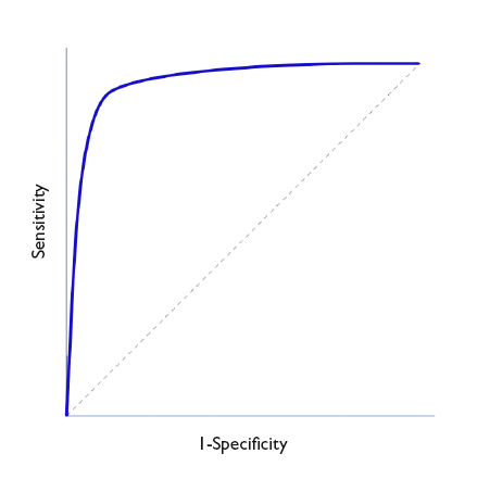
In Figure 1, Sen is represented in the y-axis, and the complement of Spe (1-Spe) in the x-axis, plotting a curve using the Sen and Spe for each value considered as a possible cut-off point. Thus, each point represents the probability of correctly diagnosing healthy and diseased individuals. The diagonal line in the graph is the shape the “curve” would take if the test had no discriminating ability.
Figure 1. ROC Curve representation. Show/hide
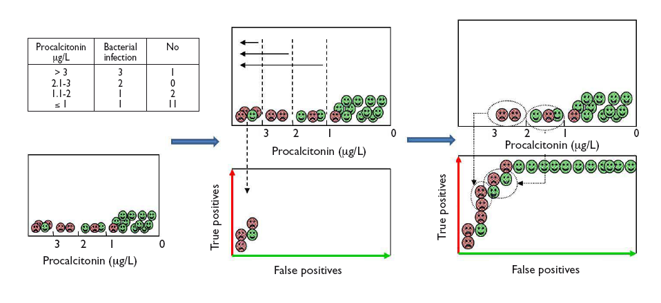
Let us see how we can construct a ROC curve based on a fictitious example of the use of PCT to distinguish between viral and bacterial infections, for which the table in Figure 2 shows the test results. To visualise how a ROC curve is constructed, for each interval of PCT values, we start by placing each of the cases of bacterial infection (true positives) on the vertical axis (upward in the graph) and the cases of viral infection (false positives) to the right and horizontally, as shown in Figure 2. In each interval, true positives pull toward the top left corner of the graph, while false positives pull away from it. This is how we obtain the curve for this example.
Figure 2. Graphical example of the construction of a ROC curve from the diagnostic test results of patients for different test cut-off points. Show/hide
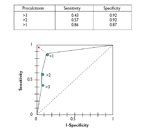
In a numerical approach, we would calculate the Sen and Spe pairs for each possible cut-off point and represent them graphically, as shown in Figure 3.
Figure 3. Graphical representation of sen and spe pairs for the construction of the ROC curve of the diagnostic test. Show/hide
As we can see in the graph, the curve usually has a segment with a steep slope in which Sen increases rapidly with barely a change in Spe: if we go up, we can increase the Sen with nearly no increase in the number of FPs. But eventually we reach a plateau. If we continue to move right, there will be a point at which the Sen will stop increasing, but the number of FPs will start to increase.
Thus, we can use the curve to calculate which is the Sen and Spe point that is most convenient based on which one we wish to prioritize. In general, for cases in which the disadvantages of a FP are lesser than those of a FN, we would be interested in a very sensitive test, so we would choose cut-off points toward the right of the curve. Conversely, when it is preferable to get a FN to a FP, we would want the test to be more specific, so we would choose cut-off points that are more to the left in the curve (fewer FPs). Last of all, in cases in which we want to maximise both Sen and Spe, the best cut-off point is the one that is closest to the top left corner of the graph.5
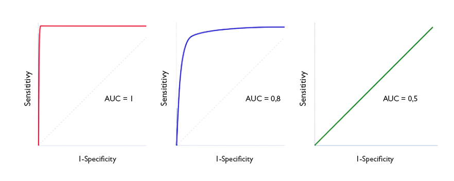
The area under the curve (AUC) is a useful parameter that represents the overall performance of the diagnostic test, the probability of it correctly classifying the patient that undergoes it, taking into account all possible cut-off points. ROC curves are always represented as a 1 × 1 square. An ideal test with a Sen and Spe of 100% would have a curve along the frame of the graph and an AUC of 1: it would always be correct. However, this is rarely seen in everyday practice, as we seldom come across tests with both a Sen and a Spe of 100%. In clinical practice, tests with ROC curves with an AUC > 0.9 are considered very accurate, with AUCs between 0.7-0.9, moderately accurate, and with AUCs of 0.5-0.7 slightly accurate. Thus, the discriminating ability of a test decreases as the AUC decreases. When the curve fits the diagonal, the AUC equals 0.5, which means that the test has no discriminating ability: the probability of guessing correctly would be the same performing the test or tossing a coin. Values under the diagonal (AUC < 0.5) correspond to errors in the classification of healthy and diseased individuals: the discriminating ability of the test would be so low that it would deem healthy individuals diseased and vice versa. Figure 4 gives examples of curves with different AUCs.
Figure 4. Three ROC curve examples. perfect discrimination (area under the curve [AUC] = 1), adequate discrimination (AUC = 0.8) and discriminating ability similar to chance (AUC = 0.5). Show/hide
Ideally, we should calculate the confidence interval of the AUC and verify that it does not include 0.5, as in this case the difference would not be statistically significant and the test would not perform better than chance in its discriminating ability. Alternatively, we could perform hypothesis testing by means of the Mann-Whitney U test, which would give us the corresponding p value. The disadvantage of this approach is that these methods are mathematically complex and are not widely available in standard statistical software.6
The AUC can also be used to compare the performance of two diagnostic tests.7 In these cases, we compare both the curves and their corresponding AUCs. The curve with the larger AUC corresponds to the higher diagnostic yield. Thus, the correct approach is to calculate the 95% confidence intervals 95% and check whether the areas overlap (in which case the yield of both tests would be similar) or whether one is larger than the other (indicating which of the tests is more powerful). Comparing the curves may be difficult sometimes, so there are mathematical methods to carry out statistical comparisons and determine whether there is a significant difference between the two curves.8-9
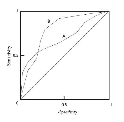
In any case, regardless of the difference in the AUC of two diagnostic tests, the shape of the curves can also give us interesting information. Figure 5 shows the superimposed ROC curves of two diagnostic tests, A and B. Although B has a larger AUC and could be considered a more powerful diagnostic test than A, we can see that when we take very low Sen values, test A has a higher Spe than test B. Thus, if we are interested in maximizing both Sen and Spe, we will choose test B, but if what we are really interested in is having a high Spe, we may want to consider using test A.
Figure 5. Comparison of the curves of two diagnostic tests. test b is more powerful (larger area under the curve), but we can see that test a is more specific for lower sensitivity values. Show/hide
To conclude, we would also like to note that ROC curves can be used not only to assess diagnostic tests, but also to compare the ability of a logistic regression model to discriminate between two groups, cases and non-cases.10 Similar to what we discussed in relation to diagnostic tests, an AUC of 1 would denote that the model offers perfect discrimination. The smaller the AUC, the smaller the discriminating ability, until reaching an AUC of 0.5, at which point the discriminating ability of the model would be the same as that of chance.
Molina Arias M, Ochoa Sangrador C. Pruebas diagnósticas con resultados continuos o politómicos. Curvas ROC. Evid Pediatr. 2017;13:12.


 Full Article
 PDF
PDF Versión española